overcomplicating my philosophy journal: senato
senato was a philosophy journal i started in high school. it was a place for short essays, arguments, and the kind of writing that does not fit a homework rubric. we published two issues. a small group of people read them. that part worked.
what did not work was everything i built around it. instead of shipping the next issue, i started designing a companion website, a distribution system, and a visual identity elaborate enough for a funded startup. the journal became a side project of its own infrastructure.
"write your spark"
the website concept was called "write your spark." the idea was simple: give contributors a clean place to publish and give readers a reason to come back. in practice i spent weeks on things that did not move that goal at all.
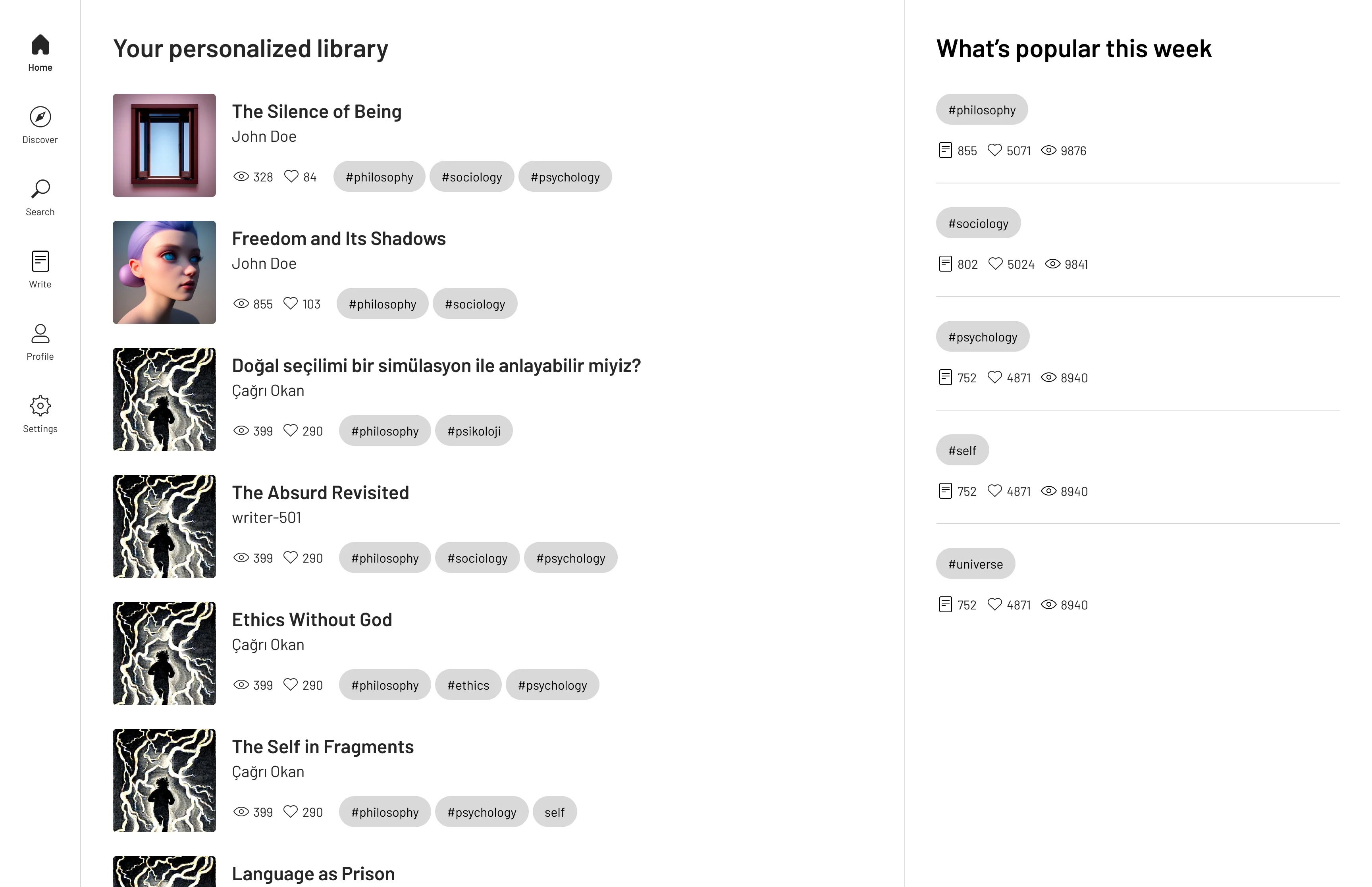
where i lost the plot
i overcomplicated all of it. grid systems, hero sections, animation timing, the exact weight of a divider line, whether a card should have 12px or 16px of padding. i treated micro-decisions like they would determine whether anyone cared about the writing. they did not.
the design kept expanding. the website had to be perfect before the third issue could go out. contributors were waiting. readers forgot we existed. i was optimizing a container while the thing inside it went stale.
what actually shipped
the site never went live. the journal did not grow the audience it could have if i had published on a schedule instead of in figma. what remains is the second issue. real writing, real layout, no javascript.
read the second issue of senato
senato was one of my first serious projects, ui, editorial workflow, team coordination, and the first time i learned that making something complicated is not the same as making it good.
lesson learned? no.